


We have all had some level of exposure to infographics, even if we don’t realise it. Your first encounter with an infographic was probably before you took your first steps, maybe in a nursery playroom or shop. The big, bubbly-lettered alphabet posters that drew you in with their bright colours, and later, charts of times tables in primary school. CBeebies’ Numberjacks and Nina and the Neurons are burned into the minds of many British noughties’ kids, helping us to learn how to spell, count, form sounds, and become terrified of the number eight. From your first science lesson in secondary school, a periodic table was stuck in your book and on the walls, but it was probably never mentioned that it is arguably the most famous infographic in history. As you entered your teens, you may have taken the bus or tube to visit your friends, relying on complex maps and timetables, downloading Google Maps on your parents’ hand-me-down smartphones. Fast-forward to University and we’re bombarded with infographics every day: Marxist posters glued to bins, Insta stories advertising rowing socials, and email newsletters from colleges, charities, and brands. Infographics are everywhere, and they can tell us a lot about the world.
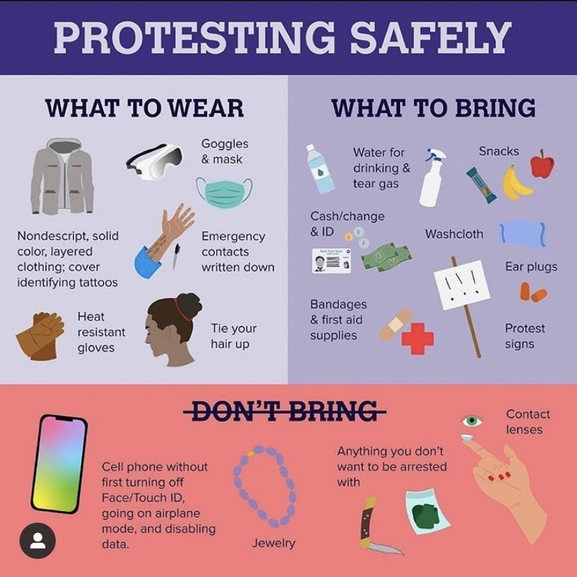
When you think of the term ‘infographic’ you may, like me, recall the Black Lives Matter protests of 2020, and the resulting influx of sympathetic, angry, and concerned posts on social media. Whilst many celebrities were condemned for participating in ‘Black out Tuesday’, without making any real commitments to racial equality, the most powerful images I saw were from activists detailing how to protect yourself from police brutality. ‘What to do if you’re sprayed with tear gas’ (milk in the eyes works a treat), ‘how to avoid being identified from CCTV’ (turn off GPS tracking on your phone, wear sunglasses, cover tattoos). The inference was not only that the police would not protect you from harm, but that they would actively target you, armed with rubber bullets and riot shields. Sales and recognition of Emma Dabiri’s What White People Can Do Next and Reni Eddo-Lodge’s Why I’m No Longer Talking to White People About Race soared as individuals grappled with their own relationships with race. Exposure to the realities of racial violence through infographics and images demanding justice for George Floyd mainstreamed these debates, with some lasting effects.
An infographic telling BLM protestors how to avoid police attention. Image credit: ACM digital library.

Although all of us are now able to create infographics online using tools like Canva, the worlds of public health and poverty reduction have relied upon images for centuries. Take Jon Snow’s 1854 cholera map, which showed how cases of the disease emerged from a contaminated water pump on Broad Street, London. Suddenly, doctors could understand that cholera came from dirty water, although it wasn’t until the advent of antibiotics that they really knew how it came about, or how to stop people from dying from it. Snow’s map was an early example of data journalism, a field that has boomed since the emergence of the COVID-19 pandemic, as graphs from the likes of the Financial Times’s John Burn-Murdoch circulated rapidly on Twitter. Lockdown may have seen many more podcasts being established, and existing shows gaining in listeners, but the scale of Coronavirus – and misinformation surrounding it – demanded clear, concise visuals. Professor Chris Whitty and his compadres were repeatedly criticised for the slew of data points, lines, and axes they presented on the BBC’s daily briefings, because people just could not understand them.

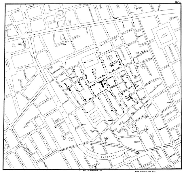
Jon Snow’s Cholera Map. Image credit: Wikipedia.
Professor Hans Rosling made this realisation years ago. Along with his son Ola and daughter in law Anna, Hans’ use of animated bubble charts, combined with his undying passion for changing people’s minds about global poverty, took data mainstream. His Ted Talks have millions of views, and you probably came across the work of the Gapminder Foundation in geography lessons, or through the elder Rosling’s hit 2018 book Factfulness. At the core of the Roslings’ work is the belief that most people do not understand a simple idea: that literacy rates, infant mortality, and hunger levels have been improving for most of the world’s population for some time. We are unduly negative about society, and most of us cannot understand what it’s like to live in extreme poverty. So, Rosling pioneered Dollar Street, which divides the population into 4 income levels and uses images to demonstrate their standard of living.

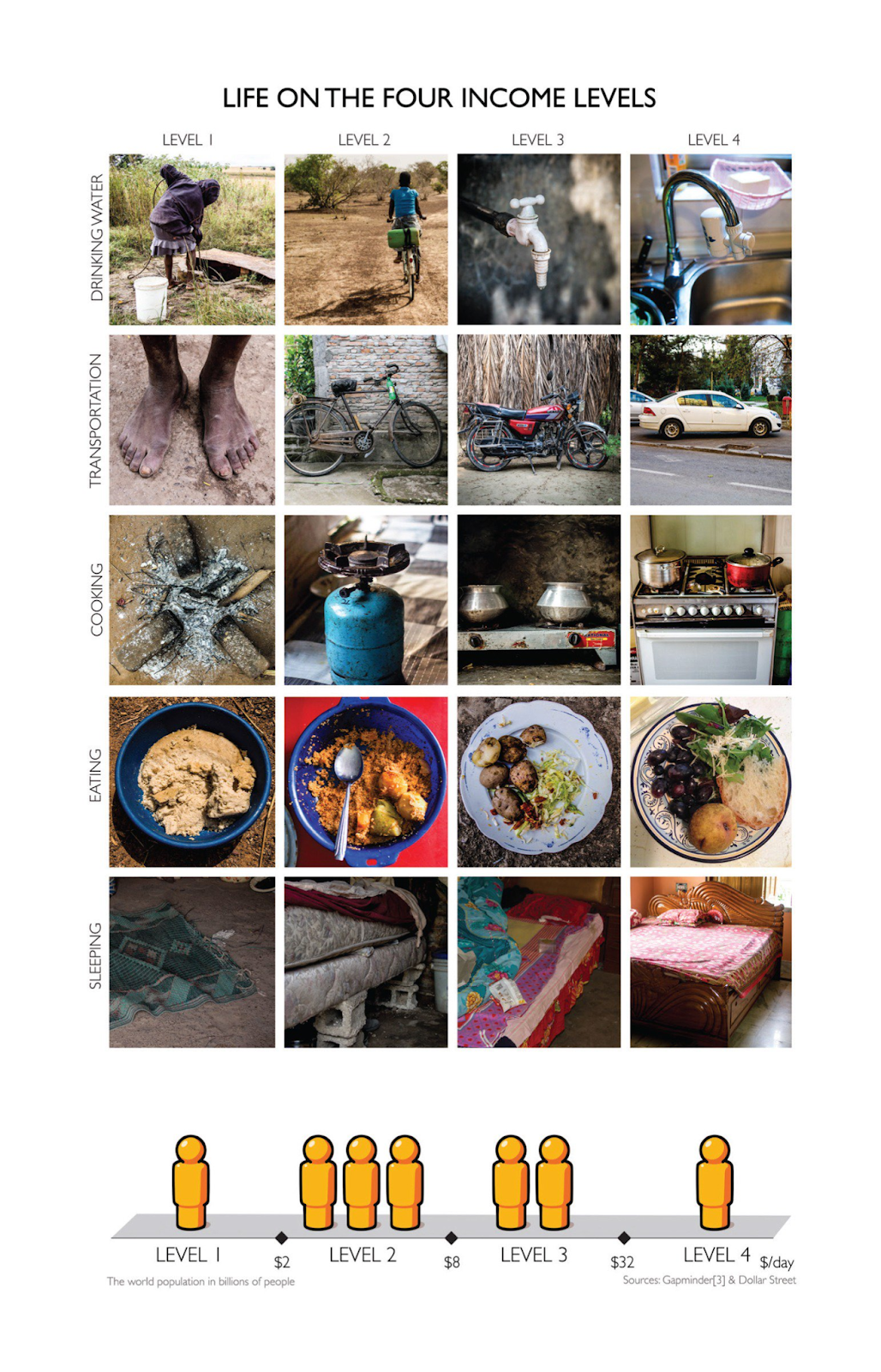
Image of Dollar Street graphic. Image credit: Twitter.
The idea seems simple, but it’s also really clever, because it recognises how some of the most important and surprising truths have been conveyed visually. In A Level Geography, we learned about the hockey stick graph, which proved that global average temperatures had bucked their multi-century trend by accelerating exponentially since the 1900s. Since then, pleading images of polar bears balancing on melting icebergs have become staples of environmental fundraising campaigns. Without the tiny diagrams on the back of Tampax boxes, many of us might never have learned how to insert our first tampon properly, and had CoppaFeel not introduced stickers to bra fitting room mirrors, we could forget to check for potentially-cancerous lumps. It’s not an exaggeration to say that infographics change, and save, people’s lives, but can a bad infographic have the opposite effect?
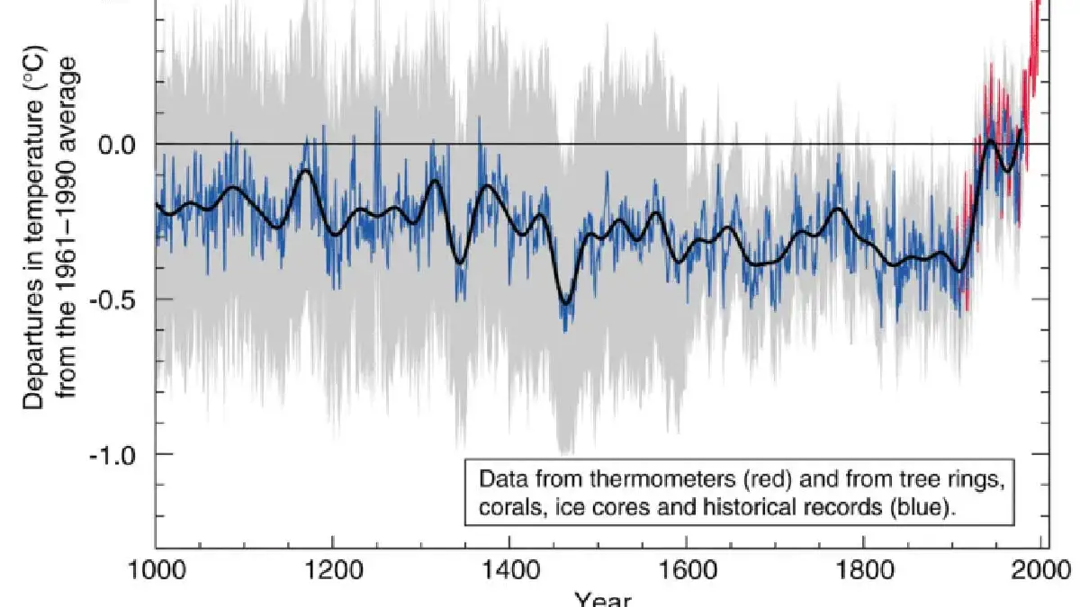
The Hockey Stick graph. Image credit: New Scientist
Many of us don’t realise that maps, of all varieties, ‘count’ as infographics, and that they are often the most controversial and dangerous of the sort. As with all infographics, maps are fundamentally flawed because they portray only one version of reality, and often conceal whose viewpoint is being privileged. Last year, the blockbuster Barbie movie was banned in Vietnam for its brief use of a map which appeared to support China’s contested claim to much of the South China Sea. Right-wing Americans also claimed, amongst other things, that Barbie was promoting Chinese propaganda. But map disputes can have deadly consequences, and borders are frequently the sites where identities are made, deconstructed, and reformed.

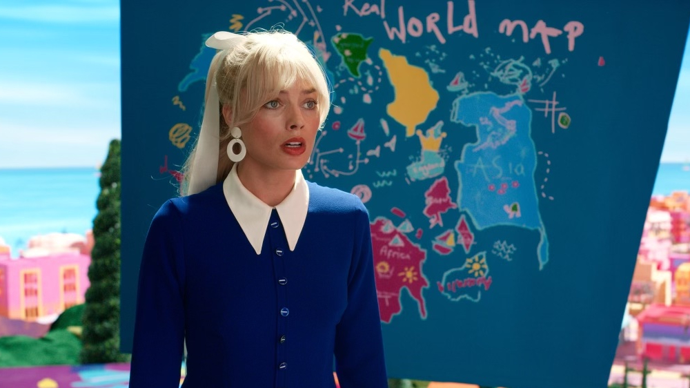
The Barbie movie’s controversial map. Image credit: Variety.
Sectarian conflict between Northern Ireland and the Republic of Ireland; Kashmir and India; Cyprus and its Northern Territories. These examples – and hundreds more which extend well beyond living memory – demonstrate how often clashing identities and politics manifest in rifts over borders. As an example, fighting over the contested territory of Western Sahara between the 1970s and 1990s led to between 14,000-21,000 deaths, with many more displaced, and the proliferation of Al Qaeda in the region. Maps matter.
Infographics might be trivial, scrollable Insta carousels, aimed at promoting the latest cause, but they can also start and end wars, stop outbreaks of disease in their tracks, and cause the UN to rethink their poverty eradication goals. They might have lost some of their value, as more and more people use publicly available software to create their own fonts, tables, and posters, but that hasn’t stopped individuals from pioneering new methods of helping us to understand big ideas. Infographics, I salute you.